Thank you for sharing the coastal love:
For your convenience this post may contain affiliate links. If you make a purchase I may earn a small commission, at no additional cost to you. I'll probably blow it on a cheapo pair of flip-flops or bottle of wine :-)
NOTE: This method works like a charm for ANY DECORATING STYLE.
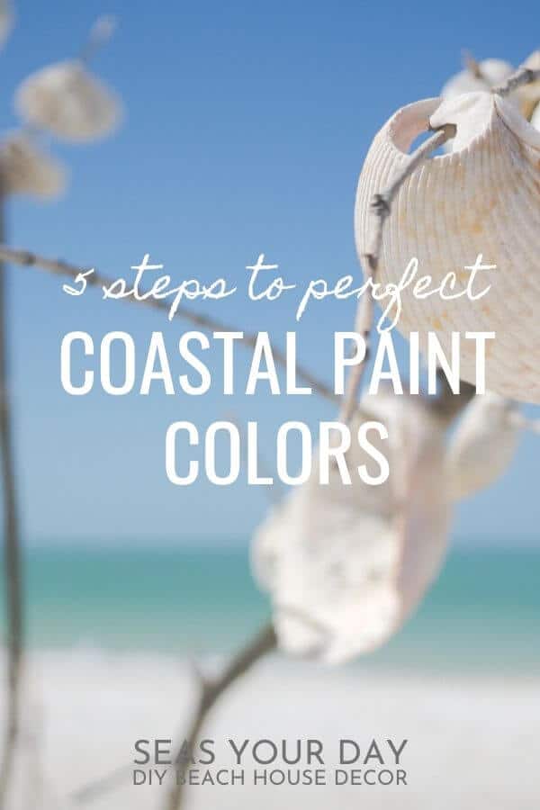
How To Coastal Paint Colors Like A Pro
5 easy steps to the perfect beach palette for your home
The most challenging (and frustrating) part of coastal home decorating is deciding on a color scheme. Without a plan you might end up with a home that looks like an all-you-can-eat-buffet at a themed seafood restaurant. You know what I’m talking about!
Since in this post we’re limiting ourselves to coastal color schemes, it would seem like we have a bit of an advantage here. After all we love the beachy blues and greens, corals, beiges and grays, and of course, white!
But if a visit to the paint store or fabric shop leaves you dizzy and confused — a bajillion shades of blue, really? — we’re going to make the room stop spinning right now.
In 5 easy steps you’ll learn to choose colors for any room that go well together, just like a pro.

What are the “right” colors for your home?
First I want you to understand that there is no “wrong” color. If you’ve ever LOVED a color but felt it didn’t work, chances are the LRV or non-complementary colors were to blame.
Let me explain…
LRV, short for a color’s Light Reflectance Value, measures the percentage of light a paint color reflects. It ranges from:
0 = Black, absorbs all the light
100= Pure White, reflects all the light
Sometimes you’ll find the LRV number on the back of a paint chip or on the paint manufacturer’s website. Since paint is a big part of your home design I wanted to mention this.
Complementary Colors play nice together. A color wheel is a handy and useful tool to check that your colors will get along.
Here’s a practical example of LRV and Complementary Colors
Why LRV is important: After trying on nineteen pink cocktail dresses you’ve found the perfect one. Later you discover that dim party lighting (absorbs light) makes the dress you LOVED in the store look washed out and… beige. Fail.
Why Complementary Colors are important: The pink dress color is perfect but the orange shoes and purple jewelry scream “who dressed you?” You loved all the individual pieces but together they don’t work.
You know this so you don’t ever dress like this, right?
Apply the same knowledge to home color choices and you will have success.
5 easy steps to choosing perfect coastal paint colors
After many years of trial and error, these are my tried and true tips to pick coastal paint colors for your home:
Coastal decor gets its cues from the water, land and sky. These colors work so effortlessly in nature. You can confidently replicate this natural palette in your home. You’ll want to pick colors that speak to you. Make you feel happy, calm and relaxed. Like you’re on a peaceful vacation…all year…wherever you live.
Finding colors you love is simple. Look to the clothes you wear, a colorful piece of fabric, a throw rug, a piece of artwork, seashells, beach glass, etc.
My Dad’s seascape oil painting and an assortment of white seashells, sand dollars and starfish were the inspiration colors for my living room. Let elements from the water, land and sky inspire your paint color choices.
Inspiration element: WATER
Whether your inspiration comes from the ocean, lake, stream or backyard pool, colors of the water are a highlight in coastal decor. Blues, greens and all the shades in between: aqua, turquoise, teal, navy, seafoam, etc.
Inspiration element: LAND
Sand, shells, driftwood, and coral are neutral inspirational colors. Think beige, coral, gray, and brown.
Inspiration element: SKY
From early daybreaks through the most vivid sunsets the sky provides an array of inspiring color palette ideas. Blue, yellow, orange, pink, purple and red. With your inspiration pieces in hand let’s move on…
The rule states that colors should be used in a room by percentage: 60-30-10. This ensures a balance of color.
Start by choosing three colors from a single inspiration piece you love for your major color choices. You’ll also be adding in two more colors : a white or beige color and a neutral color to help pull mismatched rooms together. By the way neutral doesn’t mean tan!
My neutral color is a dark brown. I have many paintings with dark wood frames throughout the house. The neutral color choice helps your eye transition from room to room.
How to pull colors from inspiration pieces: I LOVE this oil painting by my late Dad (below). It makes me feel very grounded and calm. Artwork is a good source of inspiration.
I chose a mahogany color from the rocks which is the color of many wood furniture pieces I already have. Then a gray-blue from the sky and finally a green from the water. I just knew the colors would work together.
From the painting, I also chose the yellow-beige in the sails of the boat. The white is from both the clouds and wave crest, sort of an off-white.
Using the Rule of Three, 60% of the color is going on the walls. Okay, I’ll admit, this is the scary part. I can’t tell you which of your five colors is the best choice for your walls. But since you’ve followed the first two steps, be confident. All the colors you’ve picked from the inspiration piece you love are going to work together.
Next, consider the room in its entirety.
The living room is the main space in my house. It’s long with cathedral ceilings and gets a ton of natural light. Mahogany was not ever going on the wall!
The gray-blue was a consideration as was the lightish green. Because I had lots of green accessories to decorate, that color got eliminated. And I’d just finished painting my bedroom gray-blue.
Hmmm…out of colors?! Nope. This is where the white or beige and neutral come in to help, if needed. I decided to use the yellow-beige from the sails (mid to high LRV) on the wall. Remember light colors draw the eye away and give up space making rooms look bigger. A light color would also
play nice with the dark wood furniture (using the color wheel).
If in doubt, this is a good time to paint samples on the walls and live with them for a few days. See how the light affects the colors at different times of the day. This is where knowing the
LRV of a paint color is important.

With the wall color selected, apply the Rule of Three to the second major color. Distribute the color in approximately 30% of the room. Do this with upholstered furniture pieces, large rugs, draperies, etc. You can also start to layer in the second color using accent pieces, like artwork, pottery, pillows, etc. Finally, 10% of the room will incorporate the third major color. This can be a single window shade, a brightly painted coffee table, lampshades, etc.
Fill in areas using your white or beige plus your neutral colors. This could be your trims and moldings. Or a pretty throw blanket. Or a display of beachcombing finds.
15 Best Shelling and Beachcombing Florida Beaches

Using your three major color choices, plus the white or beige and the neutral, you will now mix and match coastal paint colors throughout the rooms in your house.
This doesn’t mean you must treat every room the same. Simply begin by finishing one room with your color palette then move on to the next. You can start the color choosing process again with new colors so long as you use one of the major three colors, a shade of white or beige, and a neutral as
your 60% choice. Be free to vary the colors a shade or two lighter or darker. This leaves you open to creating unique spaces that still go well together.
In my living room example, I pulled the blue-gray from the sky in my Dad’s painting. It was used on pillows, a soft throw and a wood sign I made. Then I moved on to a bedroom and painted it in a blue-gray-green ( Sherwin-Williams TRADEWIND ) pulled from the sky color. The curtains are textured bright white (from the clouds and wave crest). Furniture is brown wood and iron (from the rocks). The artwork above the bed pulls some of the green (from the ocean). It’s a totally different looking space from the living room but it blends together beautifully in the entirety of the house.
Pro Tips:
Coastal paint colors are fickle. You will never match that particular shade of Teal or Coral in your head without a sample on hand. Keep a notebook! It’s handy whether you shop in a physical store or online.
To complete your coastal home design don’t forget to add in texture and accessories that evoke elements of sand, sea and sky.
The most important thing to remember is that you should choose coastal colors that you love. You won’t go wrong!
WANT TO REMEMBER THIS IDEA? Please PIN THIS POST to your favorite PINTEREST BOARD!
Thank you for sharing the coastal love:
